Thursday, 20 February 2014

Theme and trend boards


I have put together a selection of images to inspire our designs/theme. I have included softer geometric patterns (top right) with more graphic prints in the bottom left. I have also included a few images of apartment interiors that have the kind of vibe i feel we are aiming for. 


This is the trend board i have put together quickly that i think captures the mood we are aiming for. The colour palette works well and is suitable for our target market.

Obviously this needs to be expanded on for when the paper is glowing during the night time. However I don't really think this can be done until we have a few visualisations of how we expect this to look. 
I think when we have these designs, we can then make a mood board that shows the comparison of the paper between day and night, that way we can demonstrate the transition. 

Jordan


More Trend info.

I came across these two trend which I used for one of my projects a while ago, called 'Imagined' and 'out of the Blue' and they seem to have a very similar colour palette to what we are after for our wall coverings. They are predicted for A/W 14/15 so they are coming up soon and definitely on trend. I think they will work really well along side the 'Flawless 15/16' trend that Jordan has found as the colours are fairly similar but I was most drawn to the trends because they have some really futuristic, vibrant blue/purple tones which I think will link closely to the use of glow in the dark pigments! Combining these palettes will show that our product would be on trend now but most importantly in the future too!


Laura x

Inspiration

When I was in Manchester a few months ago I collected some images of some buildings. Many of them were of modern apartment blocks, which are lived in by our target market.
I thought these would make nice reference point for drawing as they have strong geometric shapes in them. There is also a nice link with the architecture / market, which i think is nice.


Jordan

Tuesday, 18 February 2014

Allure Glow


Hi everyone here are the information about the glowing in the dark pigment called  'Allure Glow' that we can used for our project.


Allure Glow products are not obtrusive in normal daylight environments, however, when exposed to darkness they emit an intense glow, which can then safely guide people along clearly marked egress routes. NB:Ambient light may effect the performance of the glow.

Areas of Application

  • Homes
  • Offices
  • Public Buildings
  • Educational facilites
  • Medical facilities
  • Age care facilities
  • Public Venues eg. Hostels, nightclubs, theatres
  • Factories
  • Airports
  • Tunnels, public transport, ships
Allure Glow products are cost effective, virtually maintenance free, safe, environmentally friendly, non-toxic, require no power and provide light in times when you need it.
Allure Glow products require only a very short exposure to any light source to produce its intense afterglow. The intense glow will gradually fade but it is possible for visible glow to be sustained for up to 8 - 12 hours (depending on many factors including brighness and duration of light the products have been exposed to, ambient light, temperature etc.) The pigment will however recharge each and every time it is exposed to the light source.
Life expectancy of the after glow will last as long as the host product in which it is incorporated and the denser the host material the greater the light that will be emitted.


here is the video of how it would work


http://www.allureglow.com.au/

Jinnipa :)

Presentation lay out

Me and Justina did a project last year which required us to create a T-shirt brand to be pitched to Xamax - a T-shirt printed company in Wakefield.

The winner would have their T-shirts made and sold through ASOS. my group 'identitee' came joint first with another company so I thought, as this is a similar project, we could use the outline presentation to help us do ours as it was so successful previously... Ill show you it next time we meet :)

The basic outline of the presentation went like this...

- First page - INTRODUCTION TO US....This was literally a picture of our team and names where we just introduced ourselves...we didn't need to explain job roles or anything...its kind of irrelevant as we can just get on with our roles...and speak the bits that we did.

- Our TARGET MARKET - who? where? why? brief outline

- MACRO environmental factors - the macro factors effecting our target consumer environment

- =TRENDS (faithpopcorn.com) - we found 2 consumer life stlye trends here, this isn't design trends

- Our CUSTOMER - what our customer wants? why? who are they?? Mintel report on our consumer behaviour

- COMPETITORS - Primary...secondary...and third competitors.

- MAIN primary competitors. Who are they..? we had pictures of them here. Its important just to be aware of our competition. and we said why they are...we also involved celebrity influence as our tshirt brands competitors were worn by many celebrities it was important to mention factors influencing those brands. For us it could be large companies using out competitors products...

- PRICE comparison - competitor VS what we predict to sell for... we will need more depth later on, as for this project finance wasn't a big issue...

- PERCEPTUAL MAP of where we will stand in the market...

- Id say stick trends of design here...all about design etc...BUT NOT THE PRODUCT. just design influences..as you would in a portfolio.

- INTRODUCTION OF THE BRAND...this bit is not mentioned until now! You cant introduce a brand without saying how you got to it first. its all about the impact! the wow factor as they called it....
- wordal
- pictures of brand designs
- S.W.O.T. analysis of our brand...
- Proof that it works....questionnaire? research?
- Website?
- Sales channels?
-

References :)

Hope this has helped as I wasnt here today. But i presume this is what they are after.

Katie xxx


Young professionals - Our target customer

For the purposes of the presentation...

Picture of our target consumer - http://www.aei-ideas.org/wp-content/uploads/2013/04/Businesswoman-Businessman-Young-Professionals.jpg

These two people represent us. Who we are aiming our product are. They are both stylish individuals, with hard working first careers.

We expect our customer is the following...


-          Young professionals are aged from 20-30
-          Not in education of any kind
-          Employed in a profession or white collar organisation 
L    Living alone or in shared accomondation 
-          Normal interests of that age group – partying, drinking, sports/gym, socialising, etc
-         " 62% of people finishing college pick a place to live before they choose a job" (metroedge) Link


This information will form a slide or 2 on our customer. We only need to show an understanding who we are targetting this at. 

Second part will then be that we researched that young professional rent mostly.
They are usually furnished and well decorated appartments/flats/studios/share houses (See links in previous blog posts of young professional housing)

We have therefore decided to target our product on the makers of these accommodations. They need to appeal to our target user.....as well as be affordable, well made, easy to use for our target buyer! 

 :)

Katie xx


Trend Research


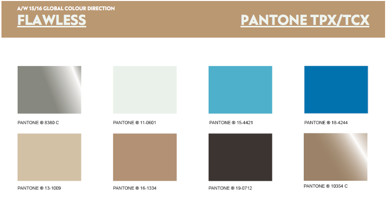
I’ve been looking at this Flawless trend for autumn/winter 15/16, which I have also been using for a different project. Although it is actually a fashion trend, interior trends tend to filter down from these fashion trends and then hang around for much longer.
The main theme behind this trend is simplicity, starkness and understated. I think this will work well with out chosen target
marjet as it has a really cool laid back kind of vibe. 
 
Sharp patterns with a minimalistic feel will fit in well to the environment we are assuming young professionals want. White and crisp with contrasts of blue, black and metallic seem to be the key colours. 
  The textile forecast has a very strong geometric pattern to it. I feel these are the style of patterns we should be aiming for. 
Transcend is another trend that I have been using which has a lot of similar elements as the flawless trend. The only different is, the patterns aren't as stark, with a softer feel and the colours are less ‘black and white’ and have a more tonal and warmer feel to them.
  Print and graphic forecasts for transcend show that geometrics will be in, again with a softer feel. I think the top right image works really well with the market we are aiming for. It has a cool relaxed vibe but still with a modern edge.


Just a few more examples of these transcend print forecasts. I definitely feel bringing elements of this trend in will work well.
  Key colours for the flawless trend. The white/light grey is used a lots as a base colour with the blues and neutrals working more as accent colours.  
  Just some more information on the transcend trend. I think combining these two trends works well, as it will make our product on trend but also we would be creating our own sub trend, so making our designs a bit different. They both have the elements of geometrics I feel taking the influence of the crisp stark pattern from flawless but working with the softer colours of transcend will combine nicely. 
  This is the colour palette which I personally feel could work the best for us (ignoring the pink)


So looking at general interior trends. I found this about florescent lighting being paired with geometric or linear patterns. So has a good link to what we are wanting to achieve. 
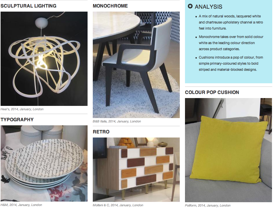
 These are some images of key points from the most resent London interior trade shows. Mono chrome seems to be key, with the colour being provided by the accessories 
Cushions from the New york trade show. Again these show the geometric patterns coming through.
These lights again have a geometric pattern to them. Ive noticed that the patterns/style has a retro vibe to them. Retro was also a key point that the london trade show picked up on. 
  Paris trade show again showing geometric forms in the shelving units and carrying on the monochromatic theme. 
 
Some textiles / cushions from the paris trade show. Again they are showing that geometrics are in at the moment and the trends I have looked at show that they are going to continue to be in so it definitely seems the way to go.

I also think that geometrics don
’t seem to date. From art deco to retro 60s and obviously now, they always seem to be popular in interior trend. 

I am I'm in contact with a friend who is a managing buyer for the home department of Selfridges in London. He's been telling me a few things about what is on trend at the moment and what he is planning on buying in for the next few seasons.
I'll upload some more information on this when i can as he has given me some greatcompanies who are using geometrics.
I will also create a trend/mood board as soon as possible to condense all this information down, im just really busy atm.

Jordan