
I’ve
been looking at this Flawless trend for autumn/winter 15/16, which I have also
been using for a different project. Although it is actually a fashion trend,
interior trends tend to filter down from these fashion trends and then hang
around for much longer.
The main theme behind this trend is simplicity, starkness and understated. I think this will work well with out chosen target marjet as it has a really cool laid back kind of vibe.
The main theme behind this trend is simplicity, starkness and understated. I think this will work well with out chosen target marjet as it has a really cool laid back kind of vibe.

Sharp
patterns with a minimalistic feel will fit in well to the environment we are
assuming young professionals want. White and crisp with contrasts of blue,
black and metallic seem to be the key colours.

The
textile forecast has a very strong geometric pattern to it. I feel these are
the style of patterns we should be aiming for.

Transcend
is another trend that I have been using which has a lot of similar elements as
the flawless trend. The only different is, the patterns aren't as stark, with a
softer feel and the colours are less ‘black and white’ and have a more tonal
and warmer feel to them.

Print
and graphic forecasts for transcend show that geometrics will be in, again with
a softer feel. I think the top right image works really well with the market we
are aiming for. It has a cool relaxed vibe but still with a modern edge.


Just
a few more examples of these transcend print forecasts. I definitely feel
bringing elements of this trend in will work well.
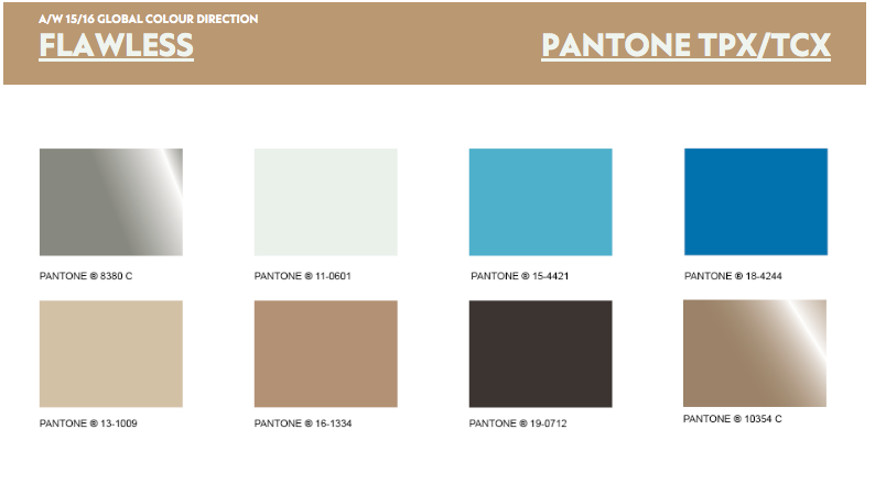
Key
colours for the flawless trend. The white/light grey is used a lots as a base
colour with the blues and neutrals working more as accent colours.

Just
some more information on the transcend trend. I think combining these two
trends works well, as it will make our product on trend but also we would be
creating our own sub trend, so making our designs a bit different. They both
have the elements of geometrics I feel taking the influence of the crisp stark
pattern from flawless but working with the softer colours of transcend will
combine nicely.

This
is the colour palette which I personally feel could work the best for us
(ignoring the pink)

So
looking at general interior trends. I found this about florescent lighting
being paired with geometric or linear patterns. So has a good link to what we
are wanting to achieve.
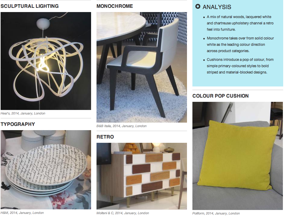
These
are some images of key points from the most resent London interior
trade shows. Mono chrome seems to be key, with the colour being provided by the
accessories

Cushions
from the New york trade show. Again these show the geometric patterns coming
through.

These
lights again have a geometric pattern to them. Ive noticed that the patterns/style has a
retro vibe to them. Retro was also a key point that the london
trade show picked up on.

Paris
trade show again showing geometric forms in the shelving units and carrying on
the monochromatic theme.

Some
textiles / cushions from the paris trade show. Again they are showing that
geometrics are in at the moment and the trends I have looked at show that they
are going to continue to be in so it definitely seems the way to go.
I also think that geometrics don’t seem to date. From art deco to retro 60s and obviously now, they always seem to be popular in interior trend.
I also think that geometrics don’t seem to date. From art deco to retro 60s and obviously now, they always seem to be popular in interior trend.
I am I'm in contact with a friend who is a managing buyer for the home department of Selfridges in London. He's been telling me a few things about what is on trend at the moment and what he is planning on buying in for the next few seasons.
I'll upload some more information on this when i can as he has given me some greatcompanies who are using geometrics.
I will also create a trend/mood board as soon as possible to condense all this information down, im just really busy atm.
Jordan
I'll upload some more information on this when i can as he has given me some greatcompanies who are using geometrics.
I will also create a trend/mood board as soon as possible to condense all this information down, im just really busy atm.
Jordan
No comments:
Post a Comment